Python Health Data Visualization: Plotly, Pandas & GeoDa

Python Health Data Visualization: Plotly, Pandas & GeoDa
.MP4, AVC, 1280x720, 30 fps | English, AAC, 2 Ch | 2h 54m | MB
Instructor: Daniel Uribe Parra
.MP4, AVC, 1280x720, 30 fps | English, AAC, 2 Ch | 2h 54m | MB
Instructor: Daniel Uribe Parra
Build clear, reproducible visuals for health & bio data using Python, Jupyter, and interactive Plotly Charts
What you'll learn
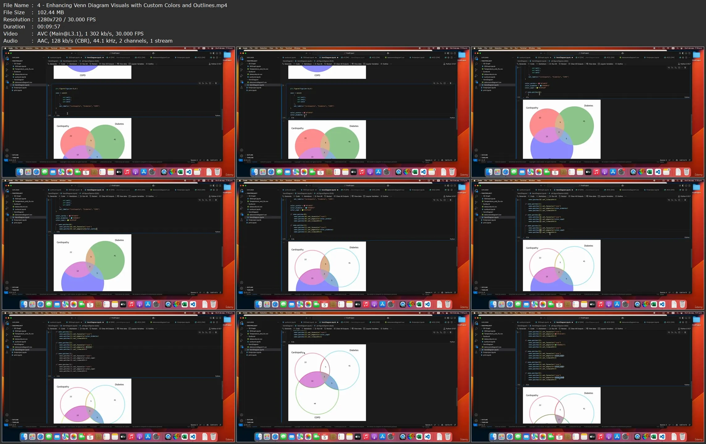
- Visualize public health data using Python, GeoDa, and Plotly to spot real-world patterns
- Clean and structure geographic/tabular data for Sankey charts and cartograms
- Create interactive visuals to show flows, spatial distribution, or case concentration
- Use visual tools to uncover health disparities and care pathways in health systems
Requirements
Basic Python knowledge, especially in Jupyter using pandas and plotly
Description
Data Visualization for Healthcare Professionals
Clear, impactful, and reproducible visualizations for health and life sciences.
In this course you’ll learn to create meaningful graphs tailored to healthcare, biological sciences, and related fields. We begin by setting up your environment step by step with Python, Jupyter Notebooks, and Visual Studio Code. You’ll work with two core libraries: Pandas for data preparation and Plotly for interactive, publication-quality visuals. We’ll also introduce GeoDa to build cartograms and other spatial analyses, giving you multiple approaches to explore geographic health data.
A basic familiarity with Python, R, Stata, or similar tools used in health data analysis is recommended so you can focus on visualization concepts while following the code.
Through hands-on exercises using real-world, anonymized datasets, you will:
- Visualize cancer statistics, multimorbidity patterns, and epidemiologic trends.
- Analyze COVID-19 data and health insurance population metrics.
- Create clear, reproducible figures for articles, reports, and presentations.
- Build geographic visualizations that reveal spatial relationships in health data.
We’ll emphasize reproducibility throughout: sharing the code behind your figures helps validate methods, fosters collaboration, and aligns with expectations of scientific publications.
By the end of the course, you’ll confidently prepare datasets, select effective visualization techniques, and turn complex health data into clear, actionable insights—ready for journals, stakeholders, or decision-makers.
Who this course is for:
This course is designed for professionals, students, and researchers interested in transforming complex datasets into clear, insightful visualizations—especially in health, social sciences, or public policy
Python Health Data Visualization: Plotly, Pandas & GeoDa