Power BI Sales Pipeline Analytics & Visualization

Power BI Sales Pipeline Analytics & Visualization
Video: .mp4 (1280x720, 30 fps(r)) | Audio: aac, 48000 Hz, 2ch | Size: 1.11 GB
Genre: eLearning Video | Duration: 11 lectures (1 hour, 58 mins) | Language: English
Intermediate Power BI training on data modelling, DAX and report creation by G Com Solutions
Video: .mp4 (1280x720, 30 fps(r)) | Audio: aac, 48000 Hz, 2ch | Size: 1.11 GB
Genre: eLearning Video | Duration: 11 lectures (1 hour, 58 mins) | Language: English
Intermediate Power BI training on data modelling, DAX and report creation by G Com Solutions
What you'll learn
Intermediate and advanced data modelling and DAX techniques
Requirements
Knowledge of the basics of Power BI Desktop
Description
Want to extend your knowledge of Microsoft Power BI? Power BI Sales Pipeline Analytics and Visualization by G Com Solutions is a practical hands-on course, designed to give experienced Power BI users further practice on data modelling, DAX, visualization and report creation.
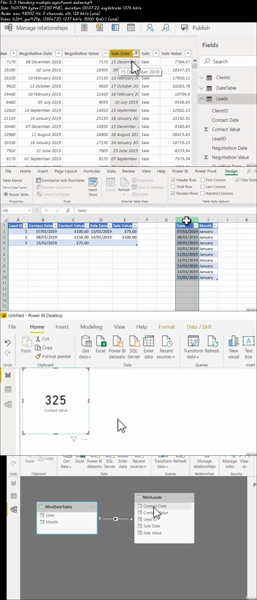
The course begins with data preparation using Power Query. We connect to our data, perform basic transformations and import an External Date Table which we then map to the dates in our main fact table.
We then set up relationships between our various tables. However, since we are dealing with a sales pipeline, we have a main fact table which contains multiple significant dates, as we track the progress of each lead from the contact stage, right through to sales.
This course will show you how to establish multiple relationships between the same two tables and then use DAX to activate the appropriate relationship as you perform calculations.
And the course provides plenty of additional practice in creating DAX measures.
Then we turn our attention to visualizing our data. We look at using the funnel visual, as well as displaying a hierarchy of images in slicers which enable the user to track the performance of sales managers as well as individual salespeople.
We also look at a useful technique for creating a chart which only becomes visible when a slicer selection is made by the user.
In short, this course will provide Power BI users who are familiar with the basics, with a challenging, hands-on workshop which will expand their familiarity with data modelling, visualization and report creation.
Who this course is for:
Existing users of Power BI looking to extend their knowledge
Power BI Sales Pipeline Analytics & Visualization