Power BI Data Visualization and Dashboard Tips, Tricks, and Techniques

Power BI Data Visualization and Dashboard Tips, Tricks, and Techniques
.MP4, AVC, 1280x720, 30 fps | English, AAC, 2 Ch | 3h 9m | 431 MB
Instructor: Emma Saunders
.MP4, AVC, 1280x720, 30 fps | English, AAC, 2 Ch | 3h 9m | 431 MB
Instructor: Emma Saunders
Power BI is a software that lets users visualize and report data flexibly and share it in a number of ways. Affordable and well-integrated with other Microsoft tools, it’s rapidly gaining market share. In this course, instructor Emma Saunders shows you how you can use Power BI to create reports and visualizations with flair and share them easily with colleagues.
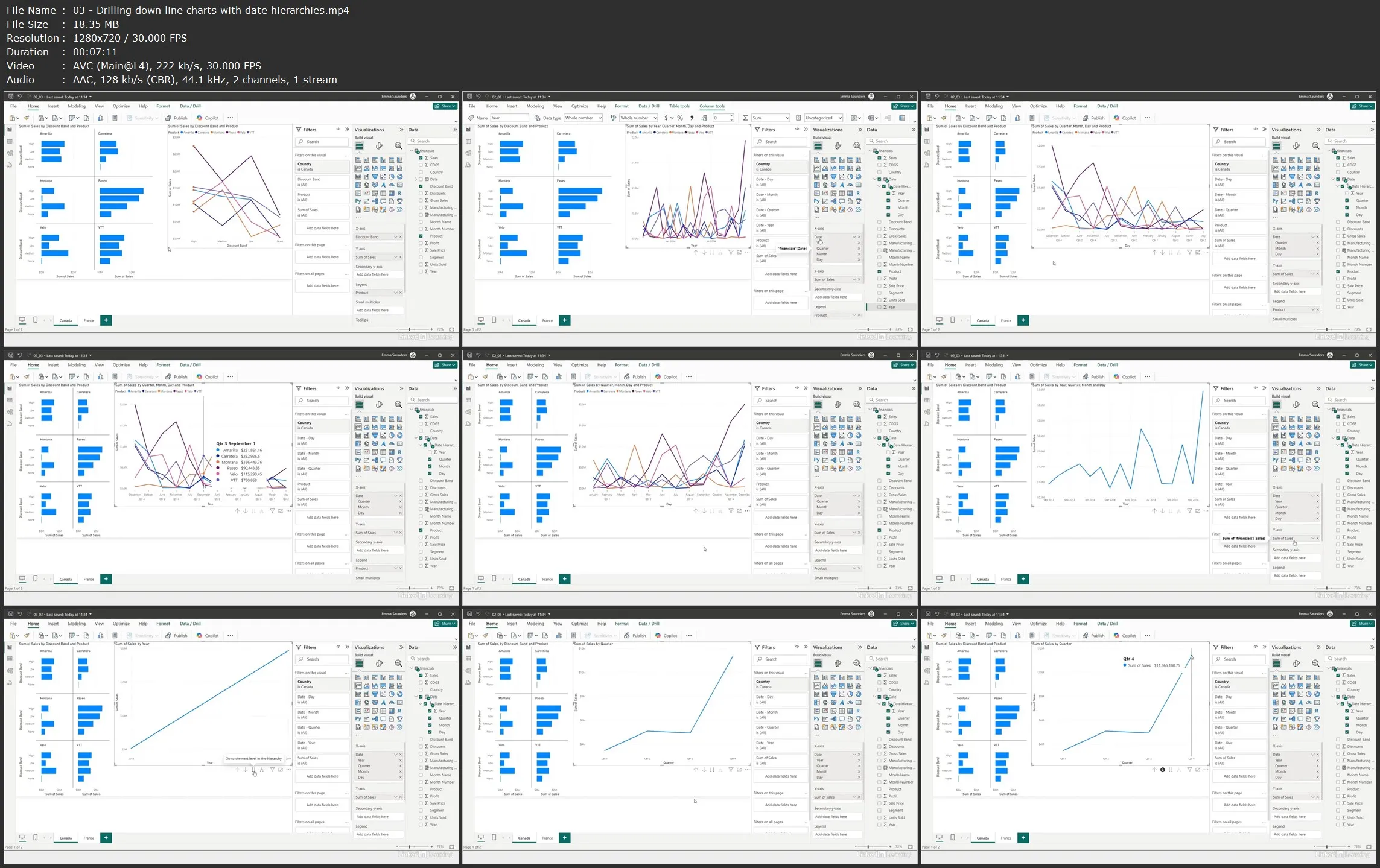
Emma explains the Power BI app (desktop) and service (web browser). She takes you through a sample report to show how it’s built, then goes over how and why to design and structure a report, including how to structure tabs, how many visuals to put on a page, and how to draw attention to one visual over another. Emma covers more advanced visuals, as well, including statistical diagrams and maps for geographic data. She walks you through how to design reports like a pro in the Power BI service, from basic layouts to choosing specific themes and fonts.
Learning objectives
- Confidently design and create multipage reports in Power BI.
- Learn how to create simple and more advanced visuals.
- Understand how many visuals to place on a page and how and why to lay them out for maximum effect.
- Learn how and why to structure your tabs.
- Use themes and colors to highlight features of the data or to minimize the appearance of visuals designed to be "page furniture" and understand the need to design with accessibility in mind.
Power BI Data Visualization and Dashboard Tips, Tricks, and Techniques