
Excel Data Visualization: Mastering 20+ Charts and Graphs (Part 1)
Excel Data Visualization: Mastering 20+ Charts and Graphs (Part 1)
MP4 | Video: 1280x720 | Duration: 4.5 Hours | 460 MB | Subtitles: VTT | Project Files
Author: Chris Dutton | Language: English | Skill level: Intermediate
MP4 | Video: 1280x720 | Duration: 4.5 Hours | 460 MB | Subtitles: VTT | Project Files
Author: Chris Dutton | Language: English | Skill level: Intermediate
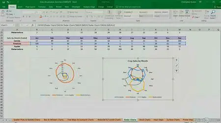
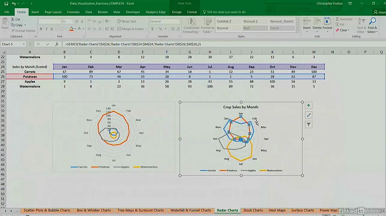
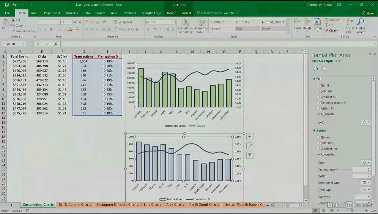
When you think data visualization, you might not think Microsoft Excel. But Excel offers a large number of charts and graphing tools that complement its data analysis toolset. This course offers a laser-focused, practical guide to over 20 useful Excel charts and graphs for data visualization. Instructor Chris Dutton reviews the key principles of data visualization, and provides some introductory tips to help you customize any kind of chart in Excel. In this section, you can learn how to adjust text and cell formatting, change the chart type and axes, and leverage built-in templates. In chapter three, Chris reviews the different chart types: from basic bar and pie charts, to scatter plots, histograms, funnel charts, and sparklines. Plus, learn how to create geospatial heat maps and 3D power maps, and combine different chart types on one sheet.
Topics include:
Data visualization best practices
Customizing charts
Applying templates
Using bar and column charts
Creating scatter plots
Building geospatial maps with Power Map
Requirements:
Microsoft Excel, ideally 2016+ or Office 365 for PC (some charts are not available in other versions of Excel)
Mac users are welcome, but note that the user experience will be significantly different across platforms
Excel Data Visualization: Mastering 20+ Charts and Graphs (Part 1)

Excel Data Visualization: Mastering 20+ Charts and Graphs (Part 1)
Excel Data Visualization: Mastering 20+ Charts and Graphs (Part 1)