
Interactive Dashboards with Excel Pivot Tables

Interactive Dashboards with Excel Pivot Tables
MP4 | Video: AVC 1280x720 | Audio: AAC 44KHz 2ch | Duration: 1 Hour | 502 MB
Genre: eLearning | Language: English
MP4 | Video: AVC 1280x720 | Audio: AAC 44KHz 2ch | Duration: 1 Hour | 502 MB
Genre: eLearning | Language: English
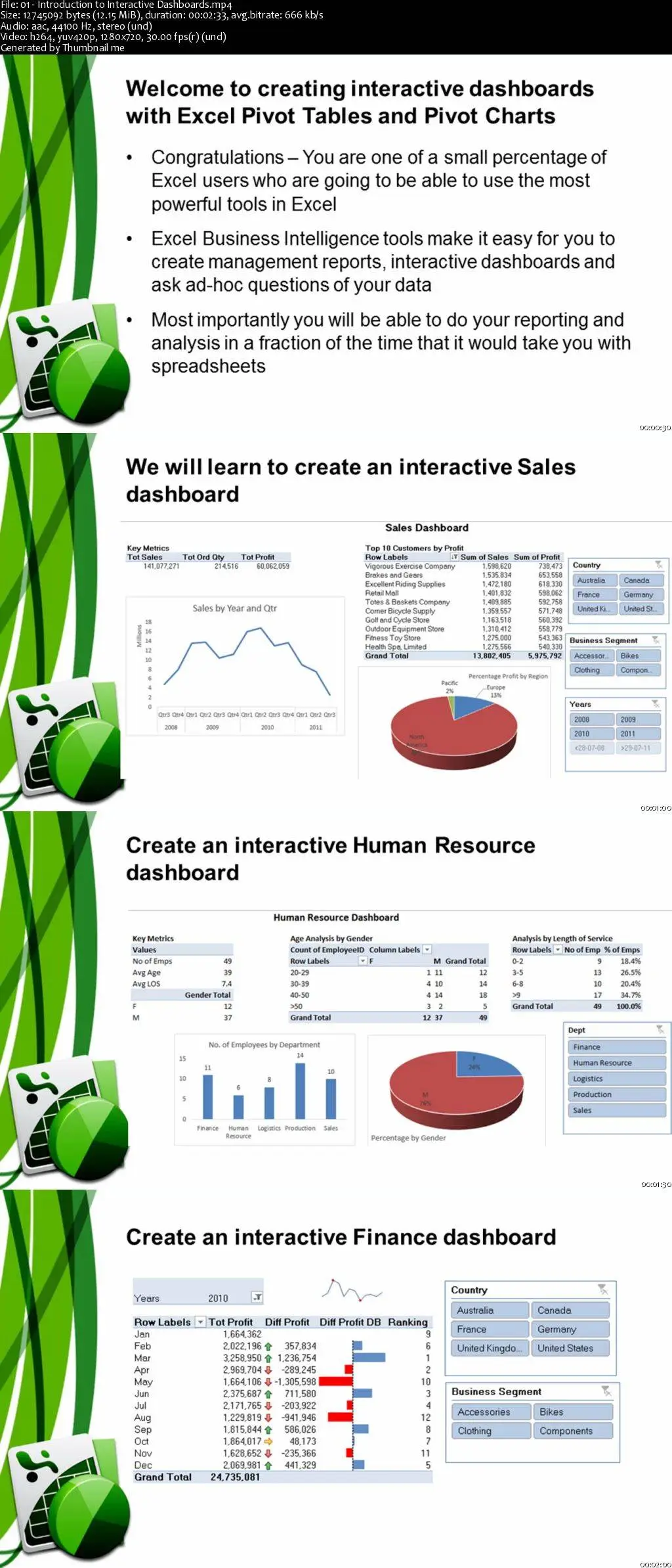
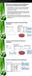
This course is for all Excel users who wish to learn how to create powerful interactive dashboards using Pivot Charts and Pivot Tables. This course will teach you to turn your Excel data into powerful tables, graphs and dashboards. In this course you will learn to create three different dashboards. The first dashboard will focus on Sales information creating key metrics, trends, top 10 analysis and a percentage contribution. The second dashboard will focus on Human Resource data and display key metrics, number of employees by age, number of employees by years of service and gender profile. The third dashboard focuses on financial information and allows the user to understand the variance of the Profit from previous months and how much it has changed from month to month. In addition techniques and tools such as sparklines, data bars, trendlines and slicers are also included. This course is very important for all Excel users who are required to develop management reporting or to perform data analysis and wish to gain insight and intelligence from their data. The course is designed to take you through step by step to create the interactive dashboards using simple drag and drop techniques. This course does not include any custom programming or macros. All the dashboards and techniques can be followed by any Excel user who understands the basic principles of Excel. An introductory knowledge of Pivot Tables and Pivot Charts will assist you in the course. However you can follow the step by step instructions if you do not have an in-depth knowledge of Pivot Tables and Pivot Charts. Please note that you will require Excel 2010 or 2013 for this course. The course is presented using Excel 2013.
Interactive Dashboards with Excel Pivot Tables