Multivariate Data Visualization with R
MP4 | Video: AVC 1280x720 | Audio: AAC 44KHz 2ch | Duration: 7 Hours | 1.76 GB
Genre: eLearning | Language: English
MP4 | Video: AVC 1280x720 | Audio: AAC 44KHz 2ch | Duration: 7 Hours | 1.76 GB
Genre: eLearning | Language: English
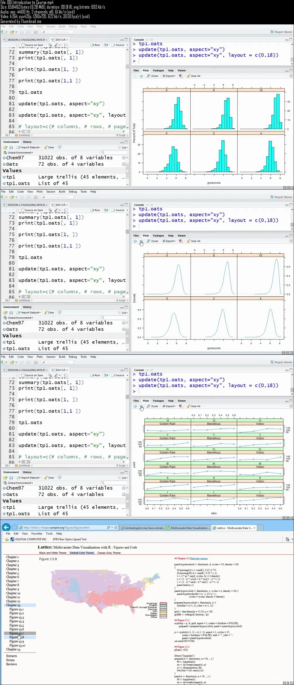
Course describes and demonstrates a creative approach for constructing and drawing grid-based multivariate graphs in R
It is often both useful and revealing to create visualizations, plots and graphs of the multivariate data that is the subject of one's research project. Often, both pre-analysis and post-analysis visualizations can help one understand “what is going on in the data" in a way that looking at numerical summaries of fitted model estimates cannot. The lattice package in R is uniquely designed to graphically depict relationships in multivariate data sets.
This course describes and demonstrates this creative approach for constructing and drawing grid-based multivariate graphic plots and figures using R. Lattice graphics are characterized as multi-variable (3, 4, 5 or more variables) plots that use conditioning and paneling. Consequently, it is a popular approach for, and a good fit to visually present the results of multi-variable statistical model fitting. The appearance of most of the plots, graphs and figures are determined by panel functions, rather than by the high-level graphics function calls themselves. Further, the user of lattice graphics has extensive and comprehensive control over many more of the details and features of the visual plots, far greater control that is afforded by the base graphics approach in R. The method is based on trellis graphics which were popularized in the S language developed by Bell Labs.


