Learn ggplot2 in R for Data Visualization

Learn ggplot2 in R for Data Visualization
.MP4, AVC, 1280x720, 30 fps | English, AAC, 2 Ch | 10h 30m | 3.96 GB
Instructor: Clara Granell
.MP4, AVC, 1280x720, 30 fps | English, AAC, 2 Ch | 10h 30m | 3.96 GB
Instructor: Clara Granell
Data Viz is essential for data analysis and data science, so become an expert in ggplot from scratch!
What you'll learn
How to use ggplot2 from scratch
How to produce publication-ready plots in seconds
Gain an understanding of the grammar of graphics, the theory behind ggplot2
Learn the basics of R that you need to start plotting
Learn why ggplot2 is the current best option for Data Visualization
Learn the structure of a plot in ggplot and its components
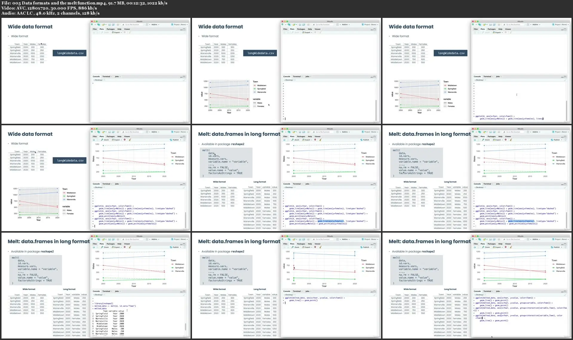
Learn how to use the different ggplot geometries
Learn how to import data into ggplot correctly
Learn how to do statistical transformations on your data before plotting
Learn how to use the different position adjustments in ggplot
Learn how to use scales properly: color, position, date and other
Learn how to use scales in manual and identity mode
Learn the different coordinate systems and how to apply them
Learn how to draw small multiples in ggplot using the faceting system
Learn how to customize the appearance of your plot using the theme system
Learn how to draw basic plots, like scatter plots, line plots, or bar charts
Learn how to display distributions: e.g. histograms, density plots, boxplots, violin plots
Learn how to draw maps: from background maps to annotated choropleth maps
Learn how to draw your own custom plots: e.g. lollipop plots, dumbbell plots
Learn how to make highlighted faceted charts
Learn how to make any plot look professional
(Don't tell anyone, but you'll also learn how to draw pie charts)
Requirements
No previous experience with ggplot2 is required
No previous experience with R is required, a crash course on R is offered at the beginning
Basic knowledge of using any programming language
Description
Hi, my name is Clara and I am a Complex Systems researcher and Data Visualization professor at the University.
In this course, I'm going to teach you how to use the ggplot2 package of R to draw amazing charts that are able to communicate what your data has to say in the most polished, professional way.
Currently, ggplot2 is the most powerful tool for building professional graphics. First, because this is a package available in R, which is one of the most used programming languages for Data Science and related fields. So, it is very convenient to be able to produce graphics in the same environment where you already do all of your calculations. Second, because it is the most flexible tool to build graphs. So, even if you don't use R for your analyses, it is worth it to use ggplot2 to draw your plots, because there's no other tool that will give you the results that you can achieve using ggplot2.
Right now, the top agencies for Data Visualization are using ggplot2 to present their data. But still, ggplot2 is a tool that not everybody knows how to use, because of its long learning curve. Because of this, some people turn to other tools, like for example, Microsoft Excel, a tool that is not genuinely made for Data Visualization purposes. So, why don't you take the amazing opportunity of learning ggplot2 now and standing out from the crowd?
When I started learning ggplot2 some years ago, I was a bit overwhelmed by the amount of functions and parameters, and also, I had never used R at the time. But I knew there wasn't any other comparable tool out there. So, I decided to learn it from the grounds, which took me a while! Of course you can watch some tutorials, and learn how to do certain kinds of plots, but I soon realized this wasn't enough to use ggplot in an independent, confindent manner. This course that I'm offering to you today is the course that I wished had existed when I was learning ggplot2. It would have saved me hours and hours of reading books, manuals, the documentation, and endless trial and error.
In this course I've followed a methodology that has proven to work over the years with my students at the University, which is: to truly master ggplot2 you need to learn its core: the grammar of graphics. But, learning this alone might be a little tough, so I've created a series of lessons that first cover a certain part of the grammar, and then we move on to learning how to draw particular plots. Both of these types of lessons are fully hands-on, so you won't be bored one second!
I really encourage you to make the decision of starting to learn ggplot2, it'll be a skill that you'll use for years to come and which will make a great difference in your career. I promise you won't regret it.
*This course covers the ggplot2 3.3.0 version (the latest release).
Who this course is for:
Any person who wants to learn how to use ggplot2 from a grounded perspective
Data Scientists interested in learning the current cutting-edge tool for Data Visualization
Scientists/researchers that need to present complex data beautifully
Data Analysts that need to plot and communicate data at some point
Data Journalists that want to learn how to plot data
UI/UX designers that want to learn how to use ggplot for showing data

Learn ggplot2 in R for Data Visualization