


Excel Interactive Dashboards and Data Analysis

Excel Interactive Dashboards and Data Analysis
Video: .mp4 (1280x720, 30 fps(r)) | Audio: aac, 44100 Hz, 2ch | Size: 2.72 GB
Genre: eLearning Video | Duration: 89 lectures (4 hour, 14 mins) | Language: English
Learn to create POWERFUL, INTERACTIVE dashboards in Excel in minutes with no coding
Video: .mp4 (1280x720, 30 fps(r)) | Audio: aac, 44100 Hz, 2ch | Size: 2.72 GB
Genre: eLearning Video | Duration: 89 lectures (4 hour, 14 mins) | Language: English
Learn to create POWERFUL, INTERACTIVE dashboards in Excel in minutes with no coding
What you'll learn
Discover the most POWERFUL tool in Excel to transform your Data into Insight and intelligence
LIFETIME access to course materials and practice activities
Learn POWERFUL data analysis techniques using comparison, trend, contribution, ranking, frequency, variance and pareto analysis
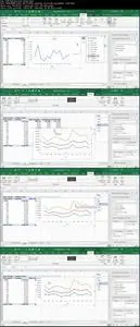
In this course you will learn how to create Sales, Human Resource and Finance interactive dashboards
Learn BEST PRACTICES for dashboard development, table and graph design
Learn powerful methods to easily GROUP and FILTER your data with a few clicks of the mouse
Requirements
You should know how to work with spreadsheets with Excel 2013 or 2016
You will require Excel 2013 or 2016
Description
Recent reviews:
"Excellent. Ian goes through the material with a brilliant mix of succinct detail. It covers a lot of ground, but he goes over things very clearly. A great course."
"Excellent course for Intermediates"
"The lessons are short enough to make one major point, then practice it. Good presentations!"
**** Lifetime access to course materials and practice activities. ****
This course is presented by Ian Littlejohn - who with over 100 000 enrollments is one of the most popular instructors on Udemy. Ian provides world leading courses on Excel, Power Pivot, Power BI and Google Data Studio.
Excel is the most commonly used data analysis tools available on the market today. In this course we show you how to create POWERFUL INTERACTIVE dashboards in minutes using standard Excel tools and techniques. (No coding or complicated methods required!)
We also discuss how to create and use BEST PRACTICE for your dashboards.
How to configure a dashboard
What graphs you should use to display what types of data
What questions you should ask of the data
What methods of analysis you can use in the data
In this course we answer these questions and more! We GUARANTEE that you will be able to EASILY create interactive dashboards and understand the most powerful methods of data analysis.
In the course you will learn the following key outcomes:
How to STRUCTURE your data for dashboards and data analysis
Create PIVOT TABLES to easily summarize and aggregate your data
Use Excel SLICERS to create filter tables and graphs
Create INTERACTIVE dashboards combining Key Metrics, Trend Graphs, Top 10 reports, Comparisons, Pie graphs and more
Understand how to EASILY create time / trend analysis using a few clicks of the mouse
Filter data and create Top 10 analysis
Learn how to do comparison, trend, ranking, contribution, variance, frequency and pareto analysis
Create a Sales, Human Resource and Finance dashboard
Use Conditional Formatting to highlight key data and trends
This course will teach you the best practices and principles for dashboard design and creating graphs. In addition you will learn the following forms of data analysis:
Comparison Analysis
Trend Analysis
Ranking Analysis
Contribution Analysis
Variance Analysis
Pareto Analysis
Who this course is for:
Excel users who want to learn reporting, data analysis and dashboards
Excel users who want to learn the power of Pivot Tables and Pivot Charts
Excel Interactive Dashboards and Data Analysis
