
Data Visualization Foundations: Chart Types

Data Visualization Foundations: Chart Types
.MP4, AVC, 1280x720, 30 fps | English, AAC, 2 Ch | 1h 7m | 154 MB
Instructor: Lewis Holmes
.MP4, AVC, 1280x720, 30 fps | English, AAC, 2 Ch | 1h 7m | 154 MB
Instructor: Lewis Holmes
Designing charts that show your data in the most accurate way isn’t straightforward. This course will teach you how to choose the right chart, avoid misleading visuals, and communicate data clearly so you can create trustworthy reports.
What you'll learn
Poor chart selection and misleading visualizations can lead to confusion, misinterpretation, and loss of trust in data. Many professionals struggle to choose the right chart for their message, often relying on default options that fail to communicate effectively. This course addresses that gap by teaching you how to select and design clear, accurate, and ethical data visualizations.
In this course, Data Visualization Foundations: Chart Types, you’ll gain the ability to confidently select and create the most appropriate charts for your data and audience.
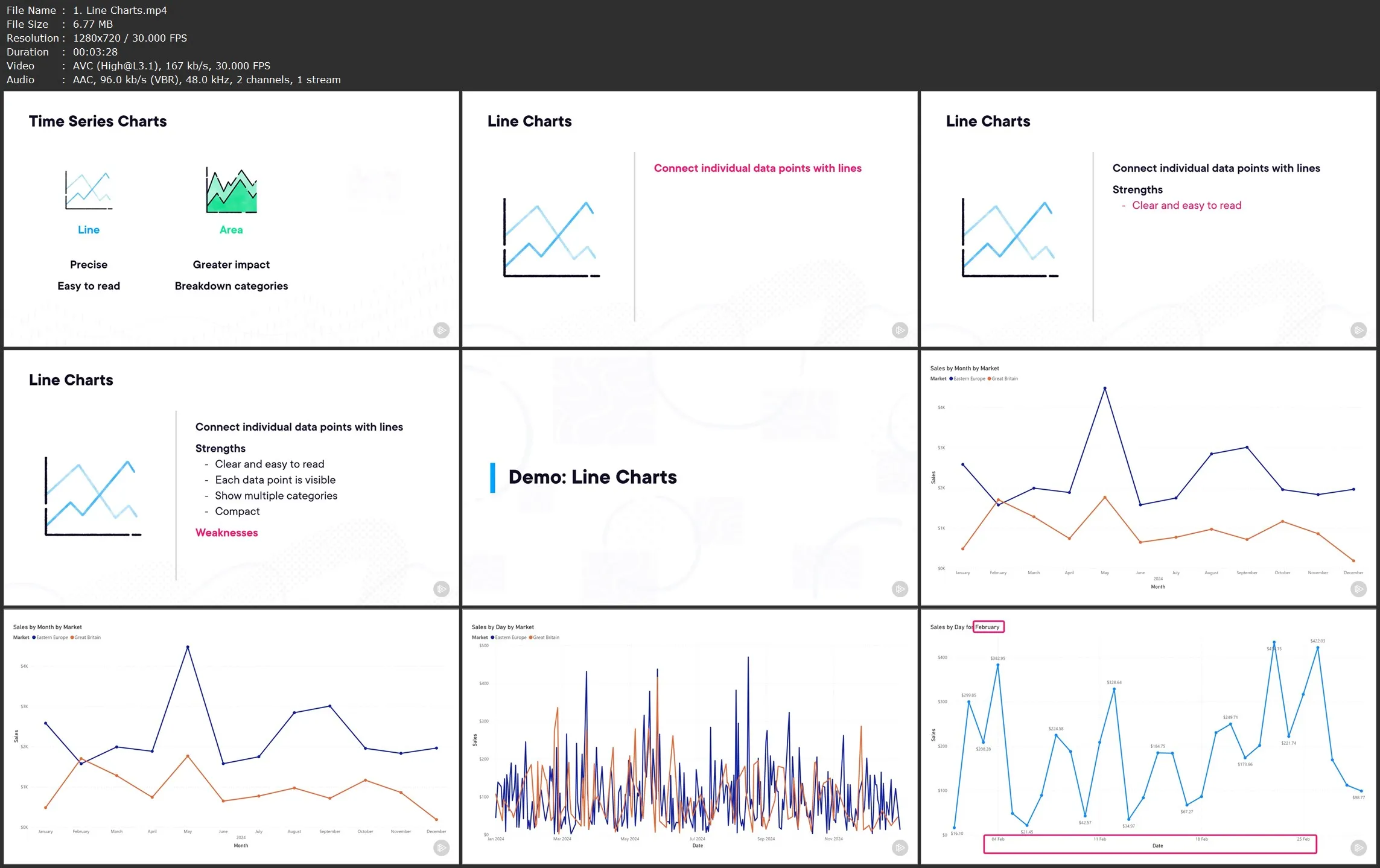
First, you’ll explore the six main chart families—including comparison, relationship, distribution, time series, part-to-whole, and geospatial charts—and understand when to use each one.
Next, you’ll discover common pitfalls in chart selection and how to recognize visuals that are misleading, confusing, or distorted.
Finally, you’ll learn how to avoid creating poorly designed charts, how to communicate data ethically, and how to apply best practices to ensure clarity and trustworthiness in your visual storytelling.
When you’re finished with this course, you’ll have the skills and knowledge of effective chart selection and visual ethics needed to turn raw data into compelling, accurate, and impactful visual insights.
Data Visualization Foundations: Chart Types