

CSS3 Flexbox Course: Build 5 Real Flexible Layouts!
CSS3 Flexbox Course: Build 5 Real Flexible Layouts!
.MP4 | Video: 1280x720, 30 fps(r) | Audio: AAC, 44100 Hz, 2ch | 1.89 GB
Duration: 5.5 hours | Genre: eLearning | Language: English
Learn CSS3 Flexbox & Build 5 real world responsvie layouts using CSS3 Flexbox!
.MP4 | Video: 1280x720, 30 fps(r) | Audio: AAC, 44100 Hz, 2ch | 1.89 GB
Duration: 5.5 hours | Genre: eLearning | Language: English
Learn CSS3 Flexbox & Build 5 real world responsvie layouts using CSS3 Flexbox!
What you'll learn
CSS3 Flexbox & How it works
All the possible Flexbox properties
Flexbox with coding exercise
Build real world flexible layouts using Flexbox
Requirements
Basic knowledge in HTML and CSS
Any code editor of your choice
Description
CSS Flexbox is a new layout module in CSS3 which is designed for laying out more complex site layouts easily and rapidly!
In this course, you will learn the CSS3 Flexbox from scratch and you will learn how to build real world flexible layouts with less and easiest code using Flexbox.
In this course, we will start with the very basics of CSS3 Flexbox and then we will gradually learn more and more about CSS3 Flexbox. You will learn what is exactly Flexbox, why do you need it, what are the main components of Flexbox, we will discuss current browser support for Flexbox.
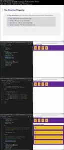
Then we will start working on flex container and we will take a detailed look at all the possible properties which can be used directly on flex container. You will also learn about the two axes of flexbox, the main axis and cross axis. We will also discuss the difference between display flex and display inline flex. And you will be learning all that with practical coding examples so you can understand flexbox module the right way.
We cover working on flex items. We will take a detailed look at all the possible properties which can be used directly on an individual flex item. Actually, you will learn about the sizing and flexibility of flex items. And of course, you will learn all that along with coding examples.
So once you learn the CSS3 Flexbox module then we will start building some real-world flexible layouts using flexbox.
You will learn about css centering using Flexbox.
I will show you how to build a simple flexible image grid with the help of flexbox. The image grid, we will build in course will look great on large screens as well as on small screens.
We will be building simple pricing tables with the help of flexbox. You will see, how with little CSS flexbox we design & align pricing tables.
We will be building a responsive header for a web page with the help of flexbox.
You will learn to build flexible cards using flexbox. We will be building these cards which will have equal height and they will look great on smaller screens; they will easily wrap on smaller screen if there is not enough space available.
By the end of this course, you will feel comfortable using Flexbox in your projects. By the end of this course, you will be a fully-fledged Flexbox developer. Thanks
Who this course is for:
Web developers eager about CSS3 Flexbox
CSS3 Flexbox Course: Build 5 Real Flexible Layouts!

Bookmark My Blog & Visit it Daily for More Video Tutorial