

Build an Interactive Data Analytics Dashboard with Python
Build an Interactive Data Analytics Dashboard with Python
Genre: eLearning | MP4 | Video: h264, 1280x720 | Audio: AAC, 44.1 KHz
Language: English | Size: 4.89 GB | Duration: 11h 59m
Genre: eLearning | MP4 | Video: h264, 1280x720 | Audio: AAC, 44.1 KHz
Language: English | Size: 4.89 GB | Duration: 11h 59m
Learn and complete all of the steps to deploy your very own data analytics dashboard on the web with Python
What you'll learn
Build an interactive data analytics dashboard using the Dash library in Python
Model coronavirus cases and deaths using generalized logistic functions
Smooth data using locally weighted scatterplot smoothing
Read and clean data so that it is suitable for modeling
Learn how to use Plotly, an interactive data visualization library in Python targeting the web
Learn HTML and CSS fundamentals to add and style elements of the dashboard
Setup an Ubuntu server running NGINX to host the dashboard on the web for all to see
Run nightly cron jobs to update the data and model predictions
Encapsulate all of your code into Python classes to ease automation
Learn how to complete a comprehensive, end-to-end project in Python using a vast array of skills
Description
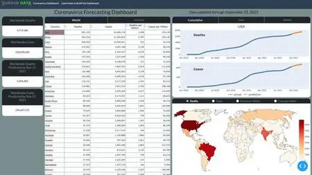
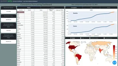
This course teaches you all of the skills to build interactive data analytics dashboards with Python. Specifically, you will be building a Coronavirus Forecasting Dashboard that shows historical and predicted values for deaths and cases for all countries in the world and US states from the ongoing coronavirus pandemic. The final product will be a live dashboard, automatically updated daily, hosted on a remote server for anyone, anywhere in the world to see!
You will learn and complete the entire process for building the dashboard including the following topics:
Getting, Cleaning, and Transforming the Data - You will learn how to collect the data, find and clean bad data, and transform it so that it can be used for building models capable of prediction.
Data Smoothing - You will learn several different techniques such as LOWESS to smooth the jagged raw data so that the model can better detect trends.
Exponential Growth and Decline Models - You will begin modeling coronavirus cases for each area of the world with these simple models that can capture a single exponential growth or decline phase, but not both.
Logistic Growth Models - You will learn about a separate class of "S-Curve" models capable of capturing both exponential growth and decline in the same model.
Modeling New Waves - Coronavirus cases appear in waves over different time periods. You will learn how to change your model so that it can detect any number of new waves in the future.
Encapsulation into Classes - After selecting your model, you will encapsulate all of the code together into Python classes, eventually to be used in your final production code.
Visualizations with Plotly - You will learn how to use the Plotly Python library to create interactive data visualizations targeted for the web
HTML and CSS - You are building a web application and will learn the fundamentals of HTML and CSS to help add customization with the help of Dash.
Building the Dashboard with Dash - You will learn how to build all of the components and interactivity of the dashboard with the Dash Python library.
Deployment - One of the most exciting parts of a project is deploying it on your own server for the world to see. You will learn two different deployment options - one simple and the other more complex, but with more flexibility.
What's Included?
This course comes with a massive amount of material including:
13 Jupyter Notebooks
26 Exercises with detailed solutions
200 page PDF of the entire course content
All production code for the dashboard
Technologies used
All code for developing the dashboard will be done using Python
Pandas will be used extensively for analyzing and transforming data
Statsmodels will be used for smoothing
Scipy will be used for building the models for coronavirus cases and parameter optimization
Matplotlib will be used in the notebooks for static visualizations
Plotly will be used for interactive data visualizations that appear in the dashboard
Dash will be used for building the dashboard itself
HTML/CSS will be used together with Dash to customize components of the dashboard
You'll learn how to setup your own Linux Ubuntu server to run your dashboard
Who this course is for:
Intermediate Python programmers excited to complete a comprehensive project covering all of the steps to launch a dashboard on the web for all to see