Analyze Environmental Impact Data with Tableau (Guided Project)
Analyze Environmental Impact Data with Tableau (Guided Project)
.MP4, AVC, 1280x720, 30 fps | English, AAC, 2 Ch | 36m | 100 MB
Instructor: Dustin Cabral
.MP4, AVC, 1280x720, 30 fps | English, AAC, 2 Ch | 36m | 100 MB
Instructor: Dustin Cabral
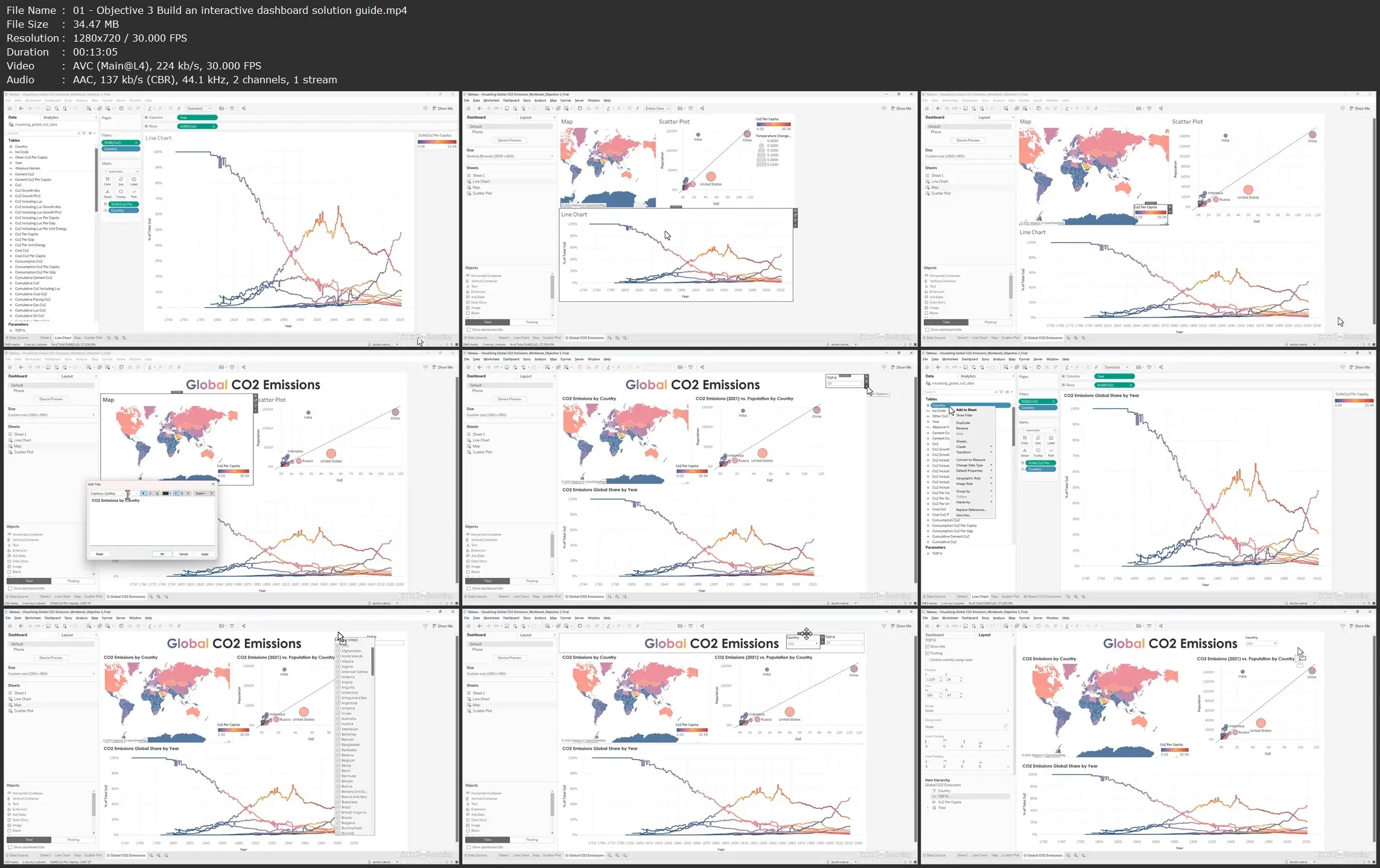
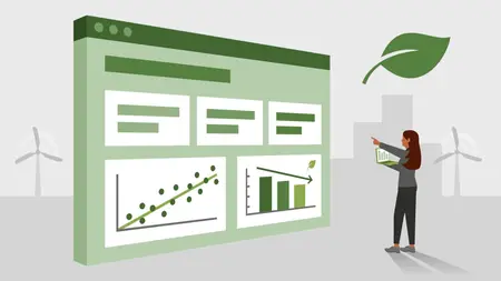
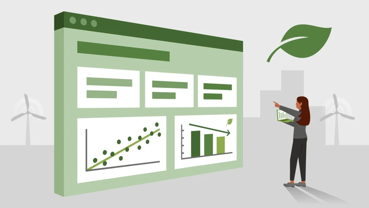
This course features a guided project in Tableau, suitable for beginners who want to learn dashboard creation basics to spot trends in historical data. Create an interactive dashboard showcasing 250 years of annual trending CO2 emissions data, then profile and QA the data.
Your first objective is to explore and profile the data while optimizing the source for visualization, including: filtering out records that aren't at the country level, updating field types, and creating a parameter. Then, visualize the data using a line chart, map, and a scatter plot to show the relationship between CO2 emissions and population. Finally, learn how to build an interactive dashboard combining your three visualizations in addition to filters/parameters for user interaction.
Analyze Environmental Impact Data with Tableau (Guided Project)