
Advanced Data Visualizations: 12 Uncommon Plot Types and How to Use Them

Advanced Data Visualizations: 12 Uncommon Plot Types and How to Use Them
.MP4, AVC, 1280x720, 30 fps | English, AAC, 2 Ch | 1h | 107 MB
Instructor: Franz Buscha
.MP4, AVC, 1280x720, 30 fps | English, AAC, 2 Ch | 1h | 107 MB
Instructor: Franz Buscha
Suggested Prerequisites
- Have a basic understanding of how data visualization works.
- Be familiar with why different kinds of plot types are used.
- Have some knowledge of univariate, bivariate, and multivariate statistics.
- Know this is not a coding course and will not teach how each graph is recreated.
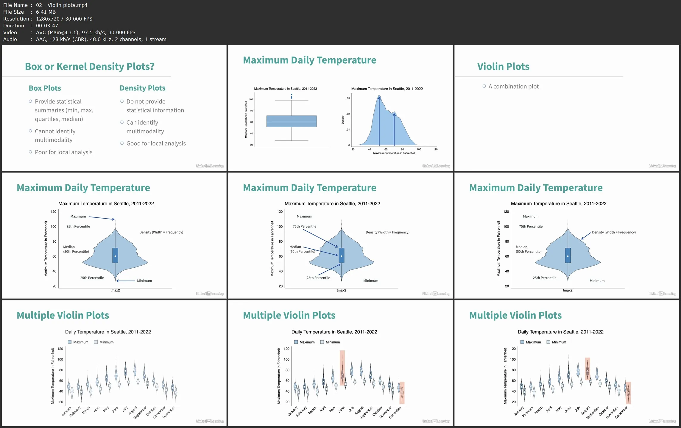
Data visualization is a critical component of data analysis and data science. In this course, economics professor Franz Buscha introduces you to 10 types of graphs that you would not commonly encounter in regular practice. For each type of graph, Franz presents a data visualization problem and an advanced graph type that solves the problem. He explains each graph and its variations, then highlights some useful tips of what to do and what not to do. Data visualizations include ridgeline plots, violin plots, heat plots, sparkline plots, rainbow plots, table plots, mosaic plots, matrix plots, ternary plots, and Chernoff faces.
Learning objectives
- Learn how to visualize multiple complex data distributions on a single plot for easy comparison.
- Discover how kernel density plots and box plots can be combined into a single powerful visualization that provides aggregate summary information and local distributional information.
- Review how color and binning choices can be used to identify bivariate densities in overplotted scatterplots.
- Learn how line plots can be reduced to their essentials and incorporated into other tables and graphs while continuing to emphasize patterns in a change of value.
- Learn how careful color gradation can be used to make sense of overplotted line plots.
- Learn how you can modify cell appearance to include bar charts to quickly give a visual overview of how the data is distributed between two categorical variables.
- Learn how a stacked bar graph can be adjusted to provide an additional dimension of data that reveals relative frequency in each bar.
- Learn how multiple scatterplots can be combined to quickly provide a visual overview of many different correlations in a dataset..
- Learn how to scatterplot three different variables that add up to a constant value on three different axes.
- Learn how representations of data as human faces can allow users to quickly compare multivariate data and identify similar and dissimilar observations.
Advanced Data Visualizations: 12 Uncommon Plot Types and How to Use Them