

Microsoft Power Bi: Dashboard Redemption (Art Of Design Ii)
Microsoft Power Bi: Dashboard Redemption (Art Of Design Ii)
Published 9/2025
MP4 | Video: h264, 1920x1080 | Audio: AAC, 44.1 KHz
Language: English | Size: 14.85 GB | Duration: 14h 18m
Published 9/2025
MP4 | Video: h264, 1920x1080 | Audio: AAC, 44.1 KHz
Language: English | Size: 14.85 GB | Duration: 14h 18m
Tips & Tricks to Take Your Dashboard Design from Awful to Awesome
What you'll learn
Identify and correct seven crucial design mistakes that Power BI developers make all the time when building reports and dashboards.
Apply color in data visuals and reports more effectively, making better choices that result in more clean, polished, and attractive presentations of data.
Create more impactful, less cluttered data visualizations that result in more insightful reports.
Identify several best practices for refining the user experience, including tips to optimize performance, how to create bookmarks, and drill-through pages.
Observe 4 dashboard redemption exercises where an ugly Power BI report will be transformed by addressing & correcting each of the 7 deadly dashboard design sins
Apply what you've learned by completing your own dashboard redemption exercise, spotting design mistakes along the way and creating your own redeemed report.
Requirements
Basic Power BI experience will is expected; concepts like DAX and Power Query Editor will not be applied extensively since this is a design choice but they will be referenced in passing, assuming you already know what they are.
Make sure you have Power BI Desktop and Microsoft Power Point (or something similar) installed if you would like to follow along with some of the Dashboard Redemption exercises.
Description
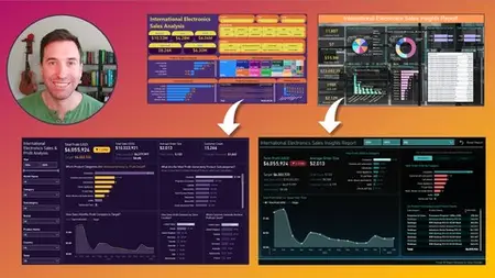
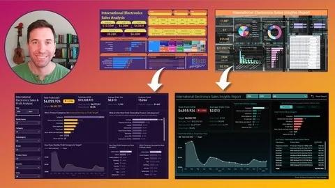
Comfortable with DAX? "Check!"Modeling data in Power Query Editor? "Check!"Designing reports that are attractive and enjoyable to use? (Silence.)Tons of Power BI developers around the world, whether they're still working on their first dashboard or just deployed their 100th report, are releasing hideous reports every single day. No judgment, of course; many people who build Power BI dashboards and reports professionally are largely self-taught and have never taken a single formal class on data visualization, design, color theory, and more important techniques that could help them make better design choices. If that describes you, and if you're one of thousands of Power BI developers around the world who are just looking for tips and techniques to elevate the presentation of their reports and data visuals, this class could be just what you've been seeking. In Microsoft Power BI: Dashboard Redemption, we're going to revisit some of the concepts from my Art of Design course and focus on 7 fundamental design sins that can ruin the impact of a Power BI report and we're going to look at a variety of examples of dashboards gone wrong and outline exactly how to fix them. In these Dashboard Redemption exercises, we'll evaluate lackluster reports inspired by real-world examples and give them visual overhauls that transform them from misses into analytics showstoppers.
Overview
Section 1: Introduction
Lecture 1 Introduction - Meet the Instructor & About This Course
Lecture 2 Introduction - The Sweatpants BI "Does Your Power BI Report Design Suck?" Quiz
Lecture 3 Introduction - What You Should Know About This Course
Section 2: The 7 Deadly Sins of Power BI Report Design
Lecture 4 Lesson 2: How Bad Power BI Report Design Works Against Us
Lecture 5 Lesson 2: What Does It Mean to Design Attractive Power BI Tools Anyway?
Lecture 6 Lesson 2: The Seven Deadly Sins of Power BI Report Design
Section 3: Color - Less Is More
Lecture 7 Lesson 3: Before We Get Started, a Few Key Comments on the Seven Design Sins
Lecture 8 Lesson 3: Color - Less is More
Lecture 9 Lesson 3: Introduction to the Color Wheel & Other Core Color Concepts
Lecture 10 Lesson 3: Contrast 101 and Cultural Considerations
Section 4: Clutter - The Little Things Add Up
Lecture 11 Lesson 4: 10 Ways Clutter Infiltrates Your Power BI Reports
Lecture 12 Lesson 4: Tips for Eliminating Cosmetic Clutter in Your Designs
Lecture 13 Lesson 4: Managing Clutter in Your Layout and Composition
Lecture 14 Lesson 4: Polishing Your Data Visuals for Clutter-Free Charts
Section 5: Dashboard Redemption #1 - Eliminating Unnecessary Color from a Sales Report
Lecture 15 Part 1: BEFORE - Identifying Problems with Color and Clutter
Lecture 16 Part 2: PREP - Quick Clean-Up of Color and Clutter Issues
Lecture 17 Part 3: AFTER - Reapplying Color Strategically to Drive Insight
Section 6: Inconsistency - Keeping Brains on Task
Lecture 18 Lesson 5: Decision-Focused Design Saves Minds
Lecture 19 Lesson 5: 4 Aspects of Power BI Report Design That Burden Cognitive Load
Lecture 20 Lesson 5: Visual Encoding
Lecture 21 Lesson 5: Providing Contextual Cues
Section 7: Dashboard Redemption #2: Destroying Clutter and Making A More Consistent Design
Lecture 22 Part 1: BEFORE - Color, Clutter, and Consistency Issues Abound…
Lecture 23 Part 2: PREP - Choosing Two Colors, Organizing Our Layout, and Cleaning Up
Lecture 24 Part 3: AFTER - Some Cool Design Tricks to Turn a Dud Report into a Showstopper
Section 8: Choice - The Devil Is in the Details
Lecture 25 Lesson 6: The Design Choices We Make Drive Insight + Data Viz 101
Lecture 26 Lesson 6: Data Visualization Traps to Avoid and Commonly Misused Charts
Lecture 27 Lesson 6: Formatting Data Visuals
Section 9: Focus - Pinpointing What Matters Most
Lecture 28 Lesson 7: Why Every Power BI Report Needs a Clear Focus
Lecture 29 Lesson 7: Thinking Like a BI Journalist and Understanding Different Audiences
Lecture 30 Lesson 7: Identifying the Type of Tool You're Building
Section 10: Dashboard Redemption #3: An HR Headcount Report in Dire Need of a Facelift
Lecture 31 Part 1: BEFORE - Finding Focus in a Busy, Cluttered HR Headcount Report
Lecture 32 Part 2: PREP - Writing Some DAX to Help Us Guide the User to Insights
Lecture 33 Part 3: AFTER - Polishing Up the Presentation, Resulting in a Retention Revamp
Section 11: Call to Action - Designing for Data-Driven Decision-Making
Lecture 34 Lesson 8: Defining & Designing for "Call to Action"
Lecture 35 Lesson 8: How We Design for "Call to Action"
Lecture 36 Lesson 8: Data Storytelling Explained
Section 12: Experience - Keep 'Em Coming Back for More
Lecture 37 Lesson 9: Why the User Experience Matters
Lecture 38 Lesson 9: 4 Vital Experience Areas We Can Control, Including Navigation
Lecture 39 Lesson 9: Getting Serious About Report Performance and Load Times
Lecture 40 Lesson 9: Manipulation & Control - Web Design Tricks that Work
Lecture 41 Lesson 9: Repeatability - Putting Yourself in Your User's Shoes
Section 13: Dashboard Redemption #4: Fixing a Report That Features All 7 Design Sins
Lecture 42 Part 1: BEFORE - Spotting All 7 Design Sins in Our Last Dashboard Redemption
Lecture 43 Part 2: PREP - Staging a New Dark-Theme Report and Adding a Profit Target
Lecture 44 Part 3: AFTER - Adding Interactive Features Like Bookmarks, Drill-Through Pages
Section 14: Dashboard Redemption CHALLENGE: Now it's your turn.
Lecture 45 Challenge Introduction and Overview
Lecture 46 Project 1 - Sean's Solution: Before & After Overview
Lecture 47 Project 2 - Sean's Solution: Before & After Overview
Section 15: Conclusion: Which Dashboard Will You Redeem Next?
Lecture 48 Conclusion
This course is intended for newcomers and professionals alike who are building Microsoft Power BI reports but recognize their design and presentation could use more finesse. Basically, if you're honest with yourself and you know you're building ugly reports and you'd like to get better, this course is for you!