Data Visualization for Data Analysis and Analytics
Data Visualization for Data Analysis and Analytics
.MP4, AVC, 1280x800, 30 fps | English, AAC, 2 Ch | 1h 40m | 302 MB
Instructor: Bill Shander
.MP4, AVC, 1280x800, 30 fps | English, AAC, 2 Ch | 1h 40m | 302 MB
Instructor: Bill Shander
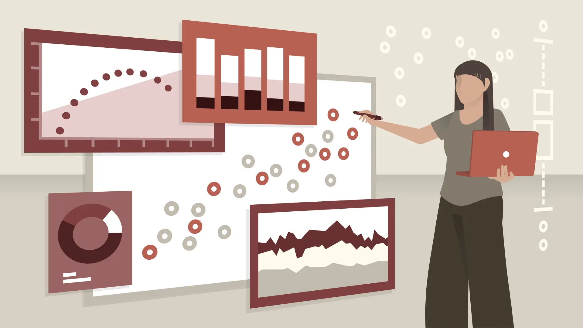
As a data analyst, you probably already know how to build visualizations and use tools like Excel and Tableau. This course challenges you to go beyond the data, beyond the software, and start thinking more clearly and strategically about the foundations of great communication design. Bill Shander, founder of Beehive Media, focuses on the key challenges that analysts face trying to communicate complex information, and how visual communication can help. He breaks down ten key components of great data visualizations—built in any program—and shows innovative ways of rethinking the slides, charts, diagrams, and dashboards you work with every day.
Topics include:
Identify a communications framework for breaking through information overload.
Explain why “story” is a critical element in any data visualization.
Support the value of headlines and providing clear focus to create data visualization with impact.
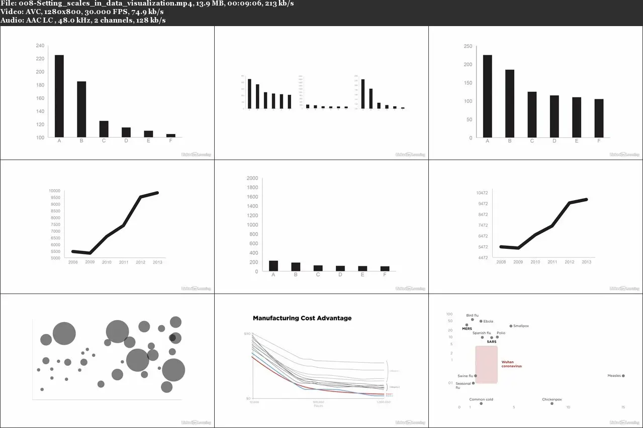
Exercise specific techniques for a variety of data visualization properties, including color, labeling, and scale.
Recognize three strategies for making effective text-based slides.
Remember three strategies for making effective charts.

Data Visualization for Data Analysis and Analytics